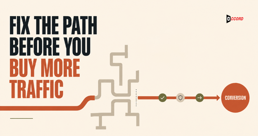
Quick answer: Before buying more traffic, make sure your B2B website explains who it serves, what problem it solves, why the solution is credible, and what visitors should do next. Then remove technical and form friction, strengthen proof, connect high-intent pages, and measure meaningful actions. More visitors cannot repair a journey they do not understand.
Traffic is easy to blame. When a website produces too few leads, the instinctive response is to run more ads, publish more content, or chase higher rankings. Sometimes reach is the real constraint. Often, however, the site is already losing the attention it has earned.
A buyer arrives on the homepage and sees a clever headline with no clear offer. A service page describes the company but not the buyer’s problem. The case study hides the business result. The contact form asks for twelve fields. Mobile visitors pinch the screen or wait for an oversized animation. Analytics count pageviews but not whether qualified people take a next step.
In that situation, buying more traffic pays to expose more people to the same friction.
The following checklist is designed for B2B service and technology websites. It does not promise a universal conversion lift, because performance depends on audience, offer, acquisition source, buying cycle, and implementation. It gives your team a disciplined way to find and prioritize avoidable problems before increasing acquisition spend.
What is B2B website conversion optimization?
B2B website conversion optimization is the process of improving how effectively a site moves qualified visitors toward a meaningful business action. That action may be requesting a consultation, booking a meeting, starting a trial, downloading a decision resource, or identifying themselves for appropriate follow-up.
B2B conversion is different from optimizing an impulse purchase. Buyers may need internal alignment, technical review, budget approval, and evidence before speaking with sales. Your website should help them complete those jobs—not push every visitor into the same “Buy Now” button.
Start by defining a primary conversion for each page type and useful secondary actions for visitors who are not ready. A service page may prioritize a consultation while also offering a detailed guide. A comparison page may direct readers to a requirements checklist. A case study may link to the relevant service and contact path.
1. Make the first screen answer four buyer questions
The first visible section should tell visitors what you provide, who it is for, what outcome it supports, and what to do next. If a buyer needs to scroll through vague brand language before understanding the offer, the page is spending attention without creating clarity.
Review the hero section without using the navigation or company name. Can a new visitor answer:
- What is this?
- Is it relevant to a company like mine?
- What business problem does it address?
- What can I do next?
Specific language usually beats inflated language. “Verified B2B lead research for sales teams” communicates more than “Unlock limitless growth.” You can still express personality, but clarity should carry the message.
Use one primary call to action. A secondary action is useful when it matches a different readiness level, but five equal buttons create a decision menu instead of a path.
2. Align every page with one search or campaign intent
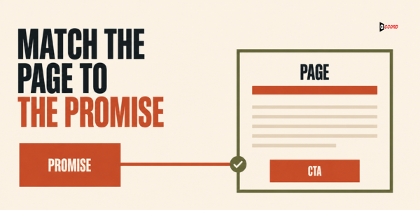
A high-converting page continues the promise that brought the visitor there. The search query, ad, social post, email link, page heading, proof, and call to action should feel like one conversation rather than several unrelated marketing assets.
If an ad promises a cold email deliverability audit but opens a general digital marketing homepage, the visitor must find the offer again. If a search result targets “CRM data enrichment services” and the landing page discusses lead generation broadly, the page may be relevant but not precise enough.
Create dedicated pages when audiences, problems, or offers differ materially. Reuse design components, but adapt the message, proof, objections, and next action to the visitor’s intent. This alignment also supports SEO because the page has a clearer topic and purpose.
3. Turn service descriptions into buyer outcomes
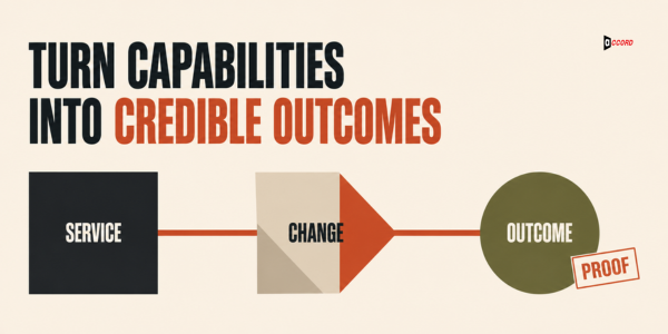
Service pages should connect capabilities to the operational or commercial change the buyer is seeking. A list of tools and tasks proves that work happens; it does not automatically explain why the work matters.
Translate each capability through three levels:
- What we do: for example, CRM field normalization.
- What it changes: sales records become more consistent and route correctly.
- Why the buyer cares: reps spend less time repairing data and reporting becomes more trustworthy.
Avoid outcomes you cannot support. “Designed to improve qualified lead flow” is responsible positioning. “Guaranteed to triple revenue” is not. The strongest copy is concrete about the process and appropriately qualified about results.
4. Place proof next to the claim it supports
Proof is most persuasive when it appears near the decision it helps a buyer make. A wall of logos at the bottom of the page cannot answer every objection raised above it. Match testimonials, examples, process evidence, credentials, and technical details to the claims around them.
Useful forms of proof include:
- A named, permissioned client example with relevant context.
- A case study that explains the starting point, work, and measured outcome.
- A screenshot or deliverable sample with private information removed.
- A clear process that reduces delivery uncertainty.
- Technology, security, or quality-control details relevant to evaluation.
- A truthful statement of experience supported by company records.
Do not invent specificity to make a page look more credible. If a result cannot be verified or disclosed, use process proof instead.
5. Create one visible action and several logical paths
Calls to action should match buyer readiness while keeping the primary action obvious. A ready buyer may book a meeting. A research-stage visitor may compare approaches, inspect a case study, or read a detailed service guide before becoming comfortable enough to talk.
Write buttons that describe the next step: “Discuss your lead generation plan” or “View the website development process” is clearer than “Submit” or “Learn more.” Place the primary CTA after the core value proposition, after major proof, and at the end of the page where appropriate.
Do not turn every paragraph into a sales pitch. Repeated buttons help only when the content between them earns the next click.
6. Remove unnecessary form friction
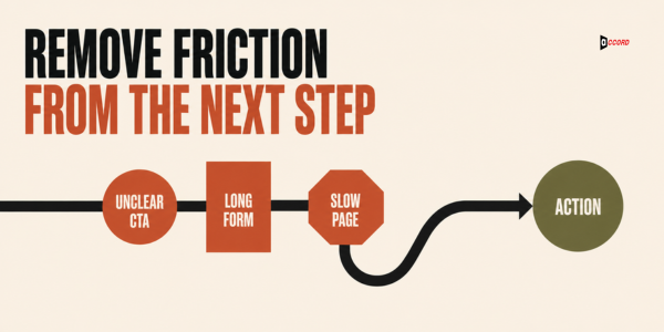
A form should request only the information needed for the promised next step and should explain what happens after submission. Excessive fields, confusing validation, unclear privacy language, and generic confirmation messages create friction at the moment of highest intent.
Audit the form on desktop and mobile:
- Are labels persistent and easy to understand?
- Are required fields genuinely required?
- Does the phone field accept realistic formats?
- Are error messages specific and accessible?
- Does autofill work properly?
- Is submitted information preserved after a correctable error?
- Does the confirmation state explain timing and next steps?
For a first conversation, name, work email, company, relevant service, and a brief message may be enough. Sales can collect deeper qualification information later. Test field changes rather than assuming shorter is always better; certain fields can improve routing and lead quality.
7. Improve speed, stability, and mobile usability
A B2B website should load promptly, remain visually stable, and make key actions easy on a real mobile screen. Heavy media, unused scripts, intrusive pop-ups, layout shifts, and small touch targets can undermine even excellent positioning.
Use field data where available and page-level diagnostics to identify the cause. Common improvements include compressing and correctly sizing images, reducing unnecessary third-party scripts, loading noncritical assets later, improving caching, limiting font variants, and reserving space for media.
Do not optimize a performance score in isolation. Check whether the page remains accessible, readable, trackable, and visually credible after each change. Google’s Core Web Vitals provide useful experience signals, but the complete buyer journey still requires human testing.
8. Make trust and risk information easy to find
B2B buyers need enough information to judge delivery risk before they contact sales. Explain who will work on the engagement, how the process begins, what inputs are required, how quality is reviewed, and what the buyer can expect during communication and handoff.
Depending on the service, trust information may include:
- A simple delivery process.
- Scope boundaries and common exclusions.
- Security and privacy practices.
- Technology or platform experience.
- Reporting cadence.
- Maintenance or support approach.
- Company location and legitimate contact details.
Place frequently asked questions near the service decision, not only in a general help center. Straight answers reduce uncertainty and also create concise passages that search and answer engines can interpret.
9. Connect content to commercial pages
Educational content should guide readers toward the service, tool, checklist, or conversation that logically follows their question. Internal links help people continue their research and help search systems understand how topics relate across the site.
Build topic pathways rather than scattering generic “read more” links. A blog about building a B2B lead list should connect to lead generation services, data enrichment guidance, a cold outreach article, and an appropriate consultation. A website speed guide should connect to development or maintenance rather than an unrelated marketing page.
Use descriptive anchor text. “Explore our website design and development services” tells users and machines more than “click here.” Keep the link promise accurate; do not route every topic to the homepage.
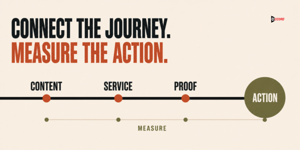
10. Measure the journey, not just the final form
Conversion measurement should reveal where qualified visitors progress, hesitate, and leave. Track the primary conversion, but also measure supporting actions such as service-page depth, case-study views, CTA clicks, form starts, form errors, scheduling completion, and qualified lead acceptance.
Define events before changing the page. Confirm that analytics does not double-count submissions or fire on a button click when the form fails. Connect web data to CRM outcomes when possible so marketing can distinguish a raw inquiry from a qualified opportunity.
Segment results by traffic source, device, landing page, audience, and offer. A sitewide average can hide a strong page or a broken campaign path. Use privacy-conscious analytics practices and obtain appropriate consent where required.
How to prioritize the ten fixes
Prioritize conversion work by evidence, severity, reach, and implementation effort. Fix broken forms, misleading messages, inaccessible actions, and severe performance issues first. Then test changes to positioning, proof, offers, and page structure.
A simple prioritization method is:
- Document the observed problem and supporting evidence.
- Estimate how many high-intent visitors encounter it.
- Define the user and business impact.
- Identify the smallest responsible change.
- Decide how success and unintended effects will be measured.
Avoid redesigning several components because the page “feels old.” That makes it difficult to know what helped. A focused CRO backlog gives design, development, marketing, and sales one shared set of decisions.
How Accord Tech Solutions approaches B2B web conversion
Accord Tech Solutions treats the website as the conversion layer of a connected B2B growth system. Search, outreach, and social content can create attention, but the website must turn that attention into trust and a sensible next action.
Our website design and development services include custom websites, responsive design, WordPress, Laravel, React interfaces, maintenance, and conversion-focused landing experiences. The work can connect with SEO, lead generation, email, social content, and CRM workflows so the buyer journey does not break at the handoff.
We do not assume every site needs a complete rebuild. An audit may reveal that focused message, form, speed, analytics, or page-template changes are the better first investment. The right scope depends on the condition of the current platform and the evidence behind the conversion problem.
Frequently asked questions
What is a good B2B website conversion rate?
There is no universal benchmark that applies to every B2B site. Conversion rate changes with the traffic source, offer, buying stage, industry, form definition, and lead-quality standard. Establish a reliable baseline for each important page and improve qualified outcomes rather than chasing an unrelated average.
Should we redesign our website to improve conversions?
Not automatically. A redesign is appropriate when the platform, information architecture, brand system, or core experience cannot support the required journey. If the foundation is sound, focused CRO improvements may be faster, less risky, and easier to measure than a complete rebuild.
Does website speed affect conversions and SEO?
Speed and visual stability affect usability, especially on mobile and slower connections. Google also uses page experience signals within a broader ranking system. Performance work should support real users first and should be evaluated alongside relevance, content quality, accessibility, and technical search health.
How long should a B2B landing page be?
It should be long enough to answer the questions and objections required for that offer, but no longer than the information earns. A complex, high-consideration service may need more explanation and proof than a simple consultation. Structure matters more than an arbitrary word count.
What should we test first on a low-converting page?
First verify tracking and identify where users fail. Then test the highest-impact uncertainty: usually offer clarity, audience-message alignment, call to action, proof, or form friction. Fix technical breakage before running a copy experiment, and change one meaningful variable when practical.
Fix the path before filling it
More traffic amplifies whatever already exists. When a website communicates clearly, loads reliably, earns trust, and creates a natural next step, additional reach has a better chance of becoming useful demand. When the journey is confusing, more traffic simply makes the leak more expensive.
Work through these ten checks with evidence from analytics, CRM feedback, user testing, and technical review. Then prioritize the changes that remove the greatest obstacle for qualified buyers.
If you need a practical assessment of the message, experience, technology, and conversion path, contact Accord Tech Solutions to discuss the right mix of focused CRO and web development work.
Methodology and sources
This checklist draws on Accord Tech Solutions’ web development and connected-growth positioning. Technical references include Google’s Core Web Vitals documentation, W3C Web Accessibility Initiative form guidance, and the Accord Tech Solutions Website Development service. Recommendations should be validated against real site data and users.
Last reviewed: August 13, 2026.